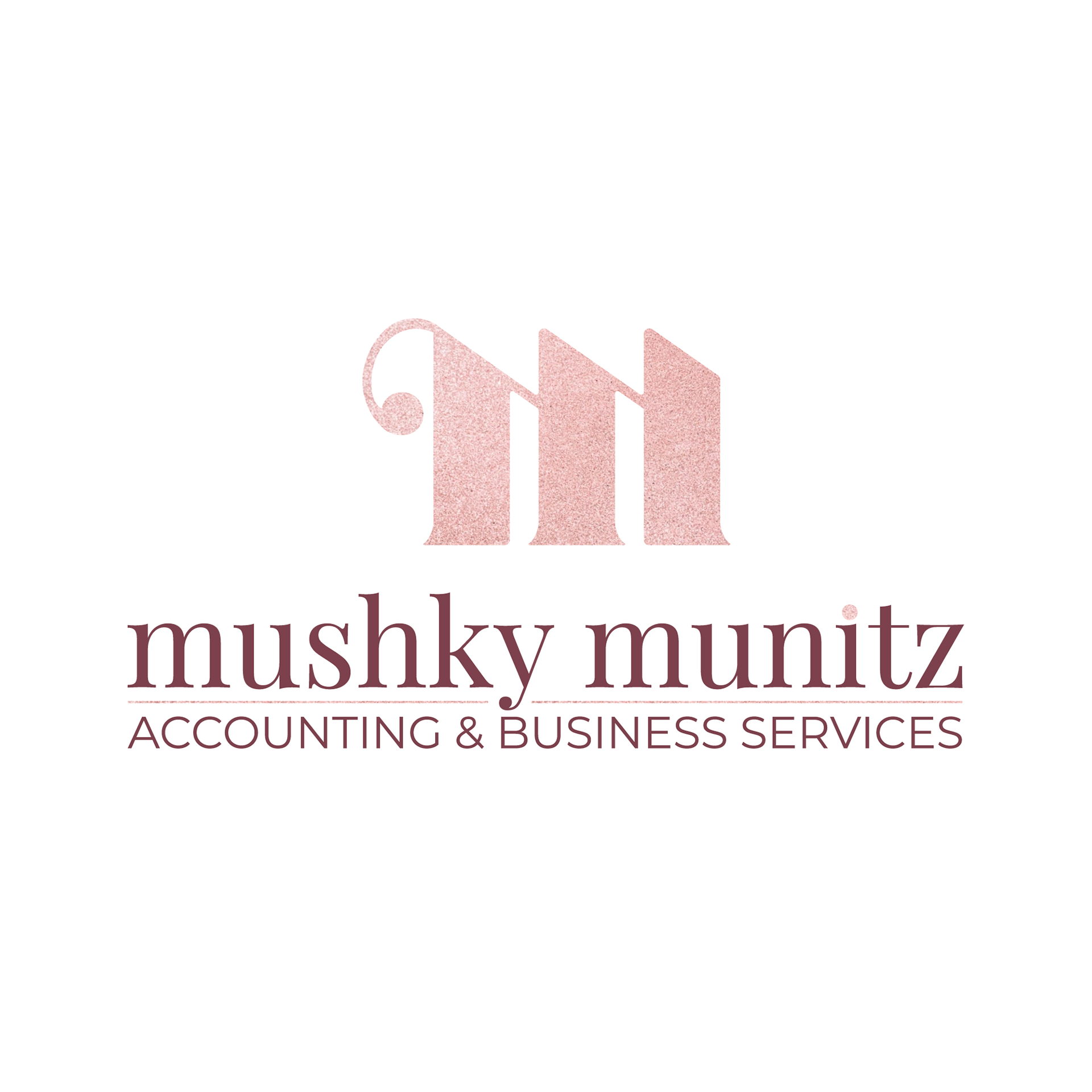
Logo Design for Mushky Munitz
Accounting & Business Services
Another project close to home; this logo is for my wife's accounting business!

The elegant lettermark slyly incorporates Mushky’s full initials and reflects the accuracy and excellence of her work, while the lowercase type and softened edges rein it in with her down-to-earth, fun, and approachable attitude.
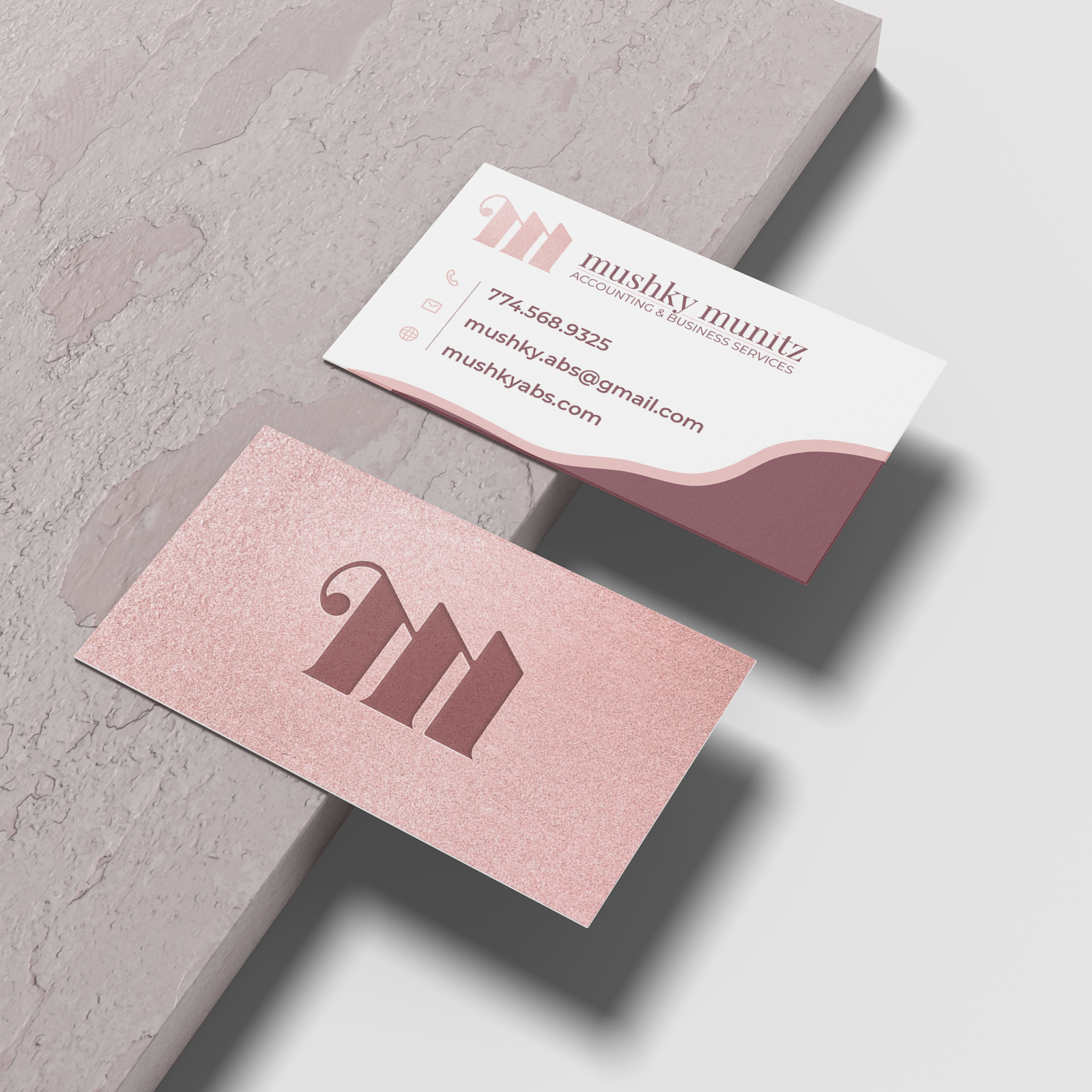
The "m" also forms three columns that represent Integrity, Efficiency, and Organization - the three pillars of her business philosophy.
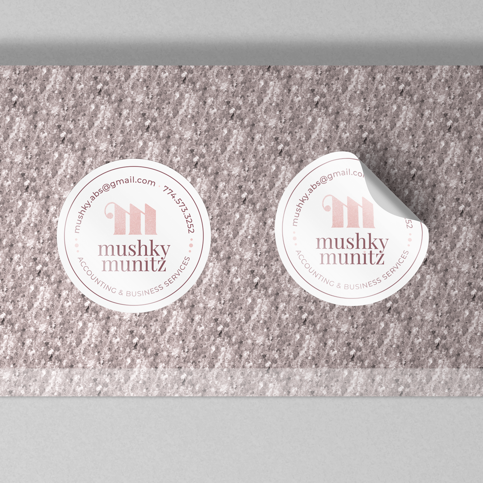
The logo is dynamic and responsive, adapting to any format. From large displays to small print items, the logo remains easily recognizable. The lettermark stands strongly on its own to identify the brand even in the smallest of spaces.

Uncompromising excellence without sacrificing approachability is the message of the logo, and that tone is carried even further with the color palette. The sophisticated yet soft colors express confidence and warmth, and proudly display the woman owned business without appearing overly feminine.