New Logo for Chabad House Jewish Center
This project was pretty close to home. Literally. Check out the new logo work for Chabad House Jewish Center of Milford, MA - my in-laws Chabad Center!
From Old to New: A Rebrand
As Chabad continues to grow in Milford, MA, spreading their signature spirit and warmth with their Jewish brethren, new mediums are employed to reach the community. Chabad's visual identity was stretching thin across print, packaging and digital platforms. It was time for a new look, one that could grow along with them.
Lamplighters: Chabad's Calling
Chabad's goal is to offer opportunities for Jews of all ages, backgrounds and affiliations to explore Jewish texts, discover their relevance and celebrate as a community.
As the local branch of the worldwide Chabad Lubavitch movement, they are committed to the Chabad tradition of creating a warm and welcoming space where every Jew, no matter their level of knowledge or experience, can feel comfortable exploring the Jewish heritage that is our birthright.
In this spirit we designed a logo that represents the flame of every Jewish soul, and the Alef, the singular core of our identity that unites every Jew. The Logomark also resembles the abstract human form, for Chabad is all about the people and the connection. Which brings us to the initial "C" for Chabad, Community, and Connection.
Brand Extension
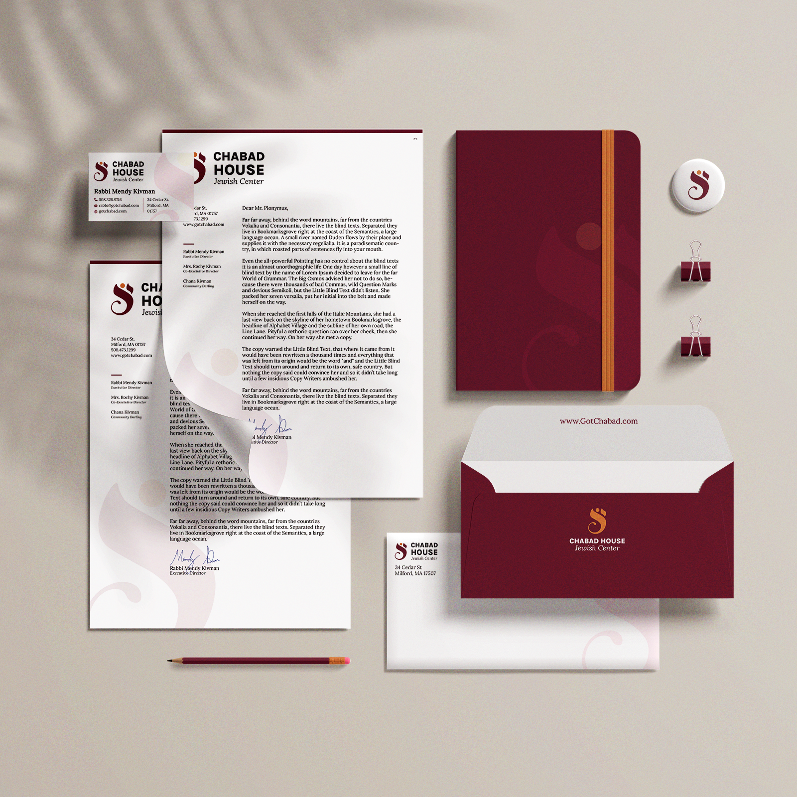
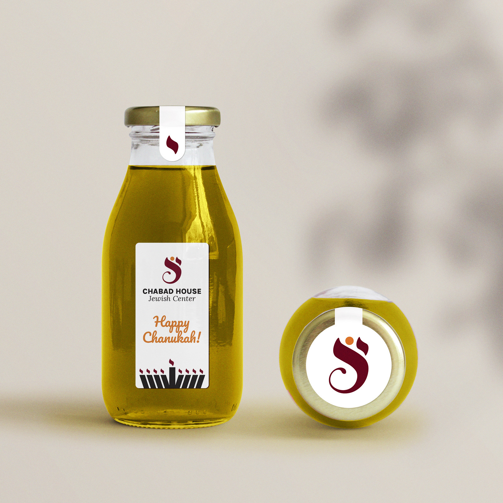
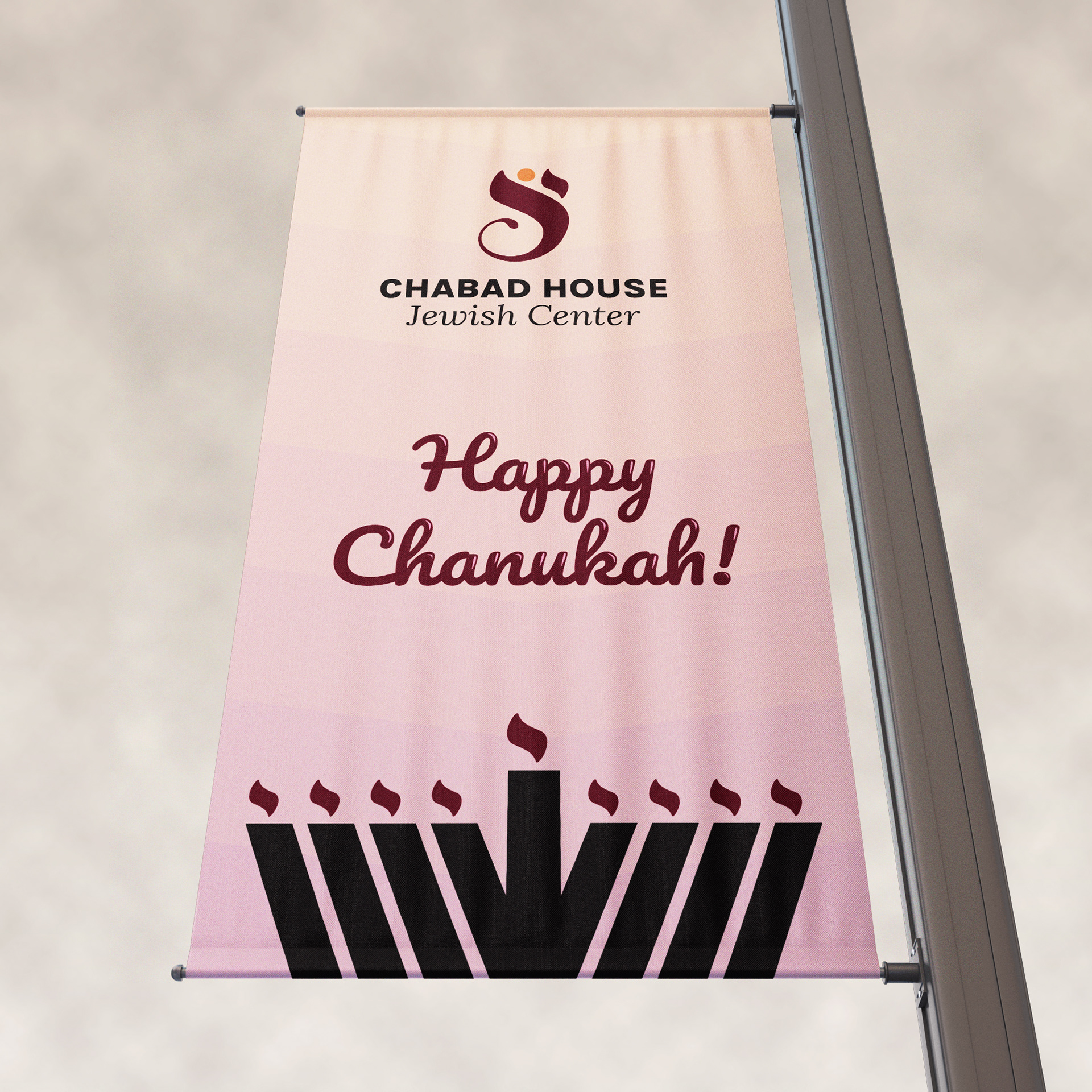
Continuing the thread of warmth and welcoming hospitality, the brand radiates in warm, vibrant tones of red and orange. The brand visuals extend with the bold shapes and simplistic patterns, creating a clean and current feel across all mediums of print, packaging, web, social media, and digital displays.

And ultimately the logo serves it's purpose as a symbol for Chabad, and an icon for Jewish pride. A symbol we can be proud to wear on our heads! (I really love the kippas!)


